


By Riaan Bekker, Force Solutions Manager at thryve
A picture tells a thousand words. We are instinctively visual creatures: seeing is believing and, I’d add, accepting. If you have to make decisions, you need to accept certain truths first. That’s the hard part: what truths will a leader settle on?
There are always competing realities in a business. They are difficult to distinguish and prioritise because they have their own motivations and uncertainties. Effective decision-making depends heavily on making sense of these differences, then making calls where the consequences are understood and anticipated.
Why is risk so slow?
Then why have risk registers dominated the world of critical decision-making for such a long time? Blame the complexity of risk data. Unlike a straightforward sales presentation or a quick chart generated from spreadsheet cells, risk data is multifaceted and formed from different parts of an organisation, complete with nuance and cause-and-effect.
Two challenges emerge from this. Firstly, businesses operate in silos, which means data is often excluded from contexts at a higher view. Secondly, presenting information at those higher views often means simplifying matters. To alternatively list and calculate every risk from every data point, then put that to an exco or board, is labour-intensive and still not effective.
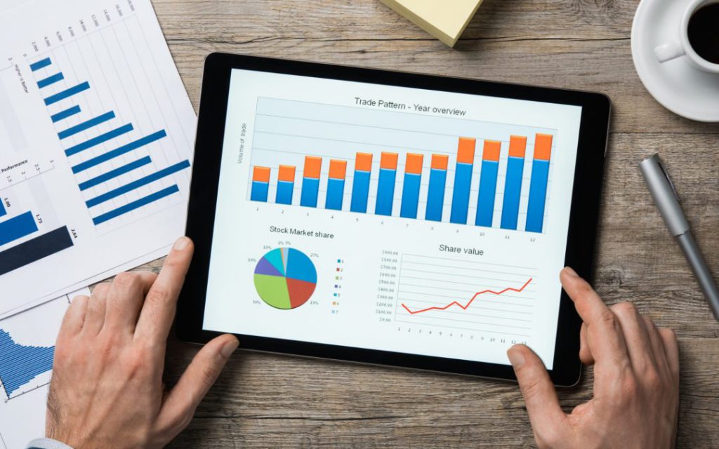
Fortunately, this is not an issue isolated to risk data. Humanity has spent aeons using images to make sense of data. Even our alphabet is just a collection of pictograms. The earliest attempts at written communication were visual, from Egyptian hieroglyphs 5,000 years ago to the paintings in the Chauvet Cave 30,000 years ago. But it was in 1786, when William Playfair published The Commercial and Political Atlas, that visual information became a norm.
It established the idea that visuals can be adequate replacements for lists and paragraphs to explain data. In fact, it’s been shown to be much better than written representations of data, as demonstrated by the stunning work of the late Dr Hans Rosling.
The dream of visualising risk
Risk analysis hasn’t been blind to this trend. Heatmaps are evidence of attempts to bring more depth and sense to risk data without boring your audience. But these attempts were hampered by technical boundaries, namely that you still had to manually collect risk data and apply an appropriate risk framework to make predictions.
Then the era of data analytics arrived. This shift was already evident in spreadsheets, where you could automate data into dynamic charts. But connectivity and digital data completed the picture.
Today, an integrated risk management platform such as Riskonnect can gather data from various parts of the business, either automatically or through customised interfaces for contributors, weigh those points based on selected frameworks and then produce dynamic visual representations of the data.
These can be expanded, isolated and simplified based on the specific audience. Not only that, but it can be achieved in real-time and pushed through dashboards. Instead of risk oversight happening every few months at a board meeting, risk data becomes immediate and visually sensible to the observer.
The new era of risk visualisation
Making accurate and certain predictions based on risk is one of the toughest tasks that leaders face. This often shunted risk to the side, something to be raised as a matter of course and not as part of strategy. Risk data simply couldn’t keep pace in a way that gave leaders confidence. Risk registers became the opposite of action.
But the rise of data visualisation is a tremendous boon for risk practitioners. They can work faster and smarter, involve more stakeholders both in collecting and presenting risk data, and feed the pace that leaders need for reliable decision-making. When utilising a cloud-based platform such as Riskonnect, they can integrate data sources, accommodate contributors and maintain a single view of risk that stays in step with the business.
A picture is worth a thousand words. So before you start typing out yet another overlong and under-appreciated risk report, why not look at how you can create a visual equivalent instead? With modern integrated risk management platforms such as Riskonnect, that is not only possible. It’s the future.